My Role
I worked on this project in a cross-disciplinary team as a UX Researcher and a UX/UI Designer.
Deliverables
User personas, low-fidelity wireframes, high-fidelity prototype, academic report
Design a user-experience aimed at awareness (and accessibility) of real-time water quality information across a university campus.
- People are still getting sick and dying from contaminated water (i.e. Flint, Michigan).
- The general public’s knowledge of water quality is quite limited.
- Knowing more about our water quality can encourage us to make more efforts to ensure that our drinking water is safe.
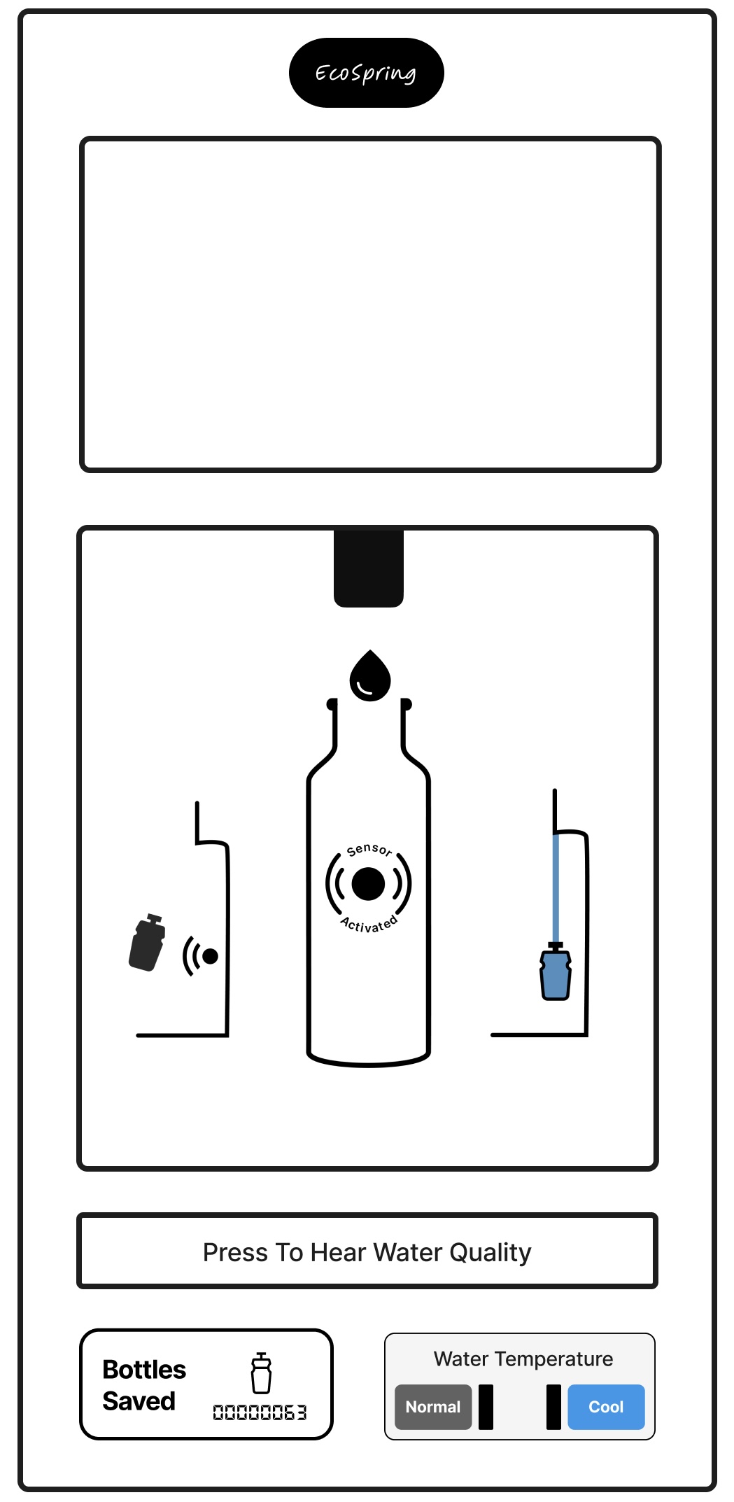
Based on our generative research, we decided on our official product idea: a water refill station that displays water quality using an interactive interface. We theorized that a familiar product (refill stations) would have the greatest chance of being adopted by our target demographic.
- Braille and audio accessibility
- Temperature toggle
- Water sensor
- Tally of bottles saved
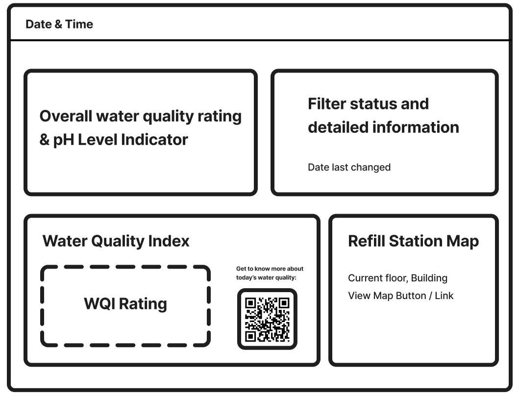
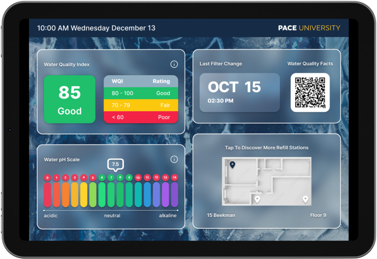
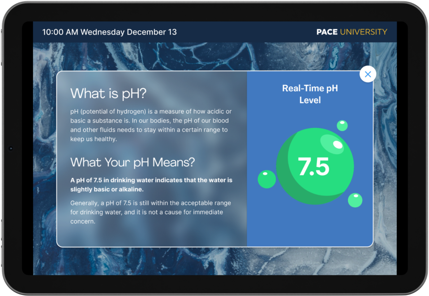
- WQI and pH levels
- Status of last filter change
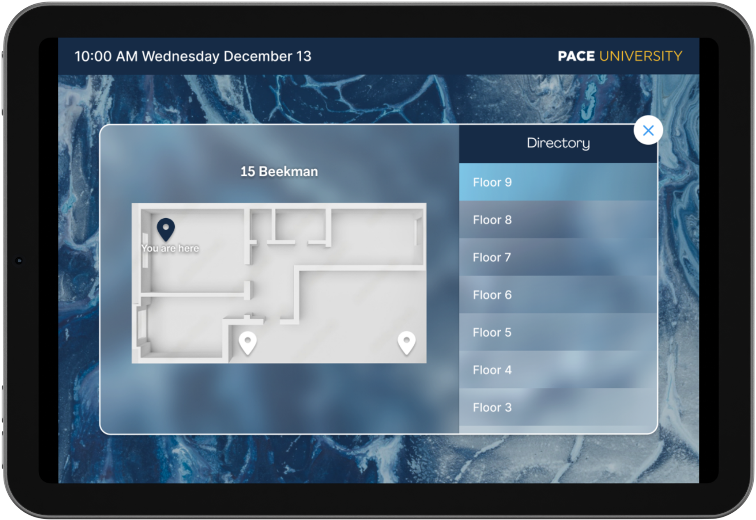
- Map of nearby refill stations
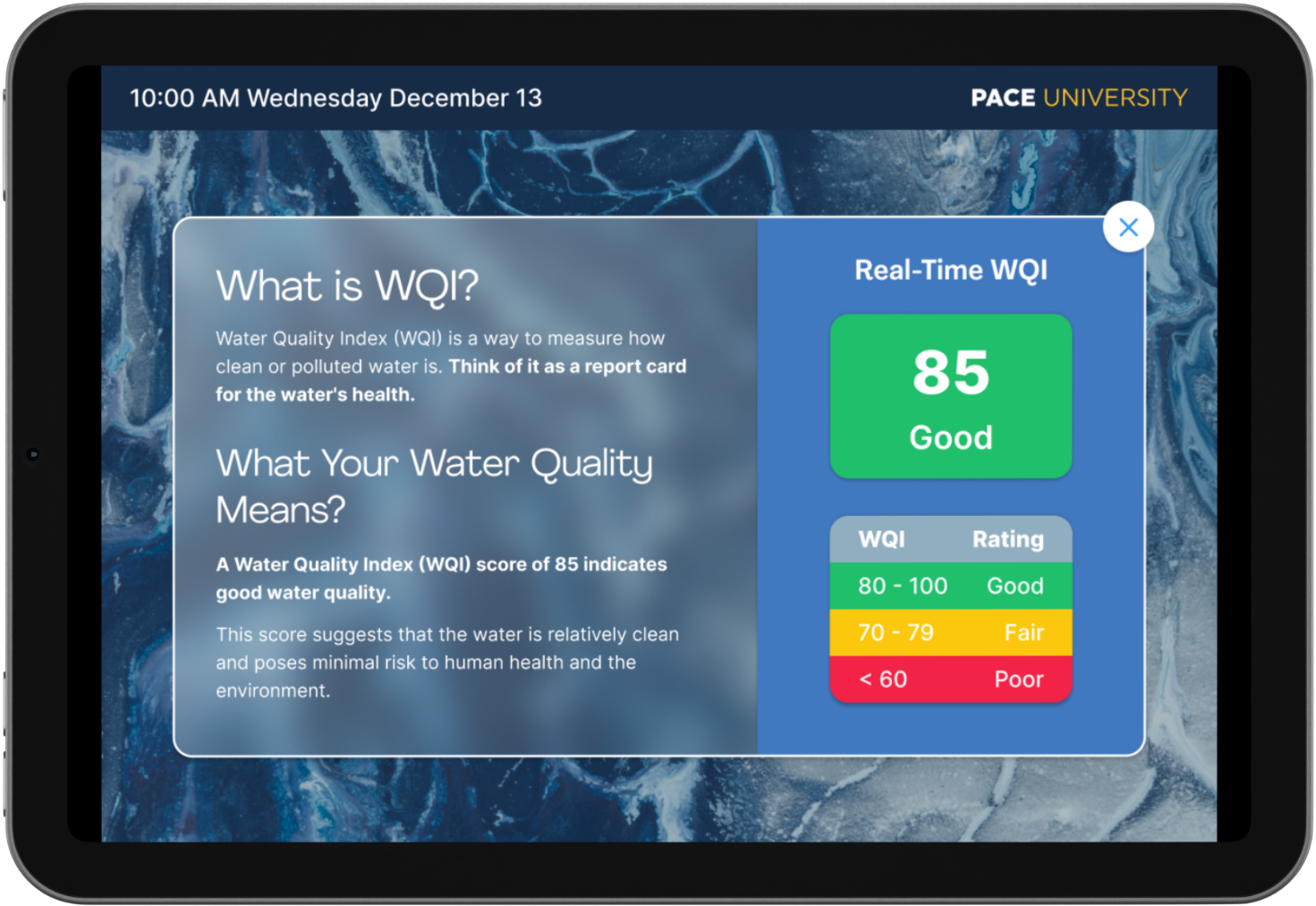
- Scannable QR code for more water quality info
After creating a low fidelity prototype of the refill station’s interface, we conducted a usability study that tested three core tasks among our 5 participants. These participants were asked a series of open-ended questions after each task and the test concluded with a post-study questionnaire. The tasks for the usability study and rationale for them were as follows:
Determine the water quality status at the current refill station
Assesses participants’ understanding of the water quality metrics and indicators provided
Find and learn more about water quality
Tests whether or not participants can easily find more general information regarding water quality
Find another refill station on your current floor
Measures the usability and discoverability of other refill stations on the map provided
Users preferred to learn more about other water quality metrics
Users wanted to access more detailed water quality index and pH level information
Users were pleased to have the QR code option though not all of them would necessarily use it
Users suggested that the current refill station location be more prominent
Users were unsure about the color coding for the pH scale
A field study was also conducted for us to better understand the goals and challenges of our target demographic that the usability study may have failed to reveal. A physical prototype of our refill station was placed in three regions with varying foot traffic. Participants for this study were again asked to complete a set of three tasks and were encouraged to explain the rationale behind their behaviors. At the end of the field study, an SUS was provided and revealed that our prototype received an average score of 93.96, indicating a positive assessment of our product.
Participants would prefer to see more landmarks on the map to improve findability
Participants would like to learn where their water is sourced from
Participants believe that the refill station should include a bubbler
Participants were confused by the labeling associated with the QR code
Some participants were unaware that the WQI and pH scale cards were interactive
- The WQI and pH scale appeared to be sufficient indicators of water quality upon first glance for participants.
- The QR code provided participants with the option to learn more about water quality without having to spend too much time at the refill station.
- A majority of our participants expressed interest in using our product if implemented in real life.
- Future improvements should include an additional way for wheelchair users to navigate through the interface since it may be out of reach for them.
